5 Mobile Web Crimes we need to stop committing
Mobile Strategy
14 September 20151. Auto-Deep Linking
If I want to open your app, I’ll open it. The fact I installed it once doesn’t mean I want it to be my default experience. By all means offer me the option by way of a UI element (button, link, etc) to jump in to the app in a contextually accurate place, but don’t make the decision for me.
Recently, both Yelp and Pinterest have incurred my wrath by doing this. Please don’t follow their lead.
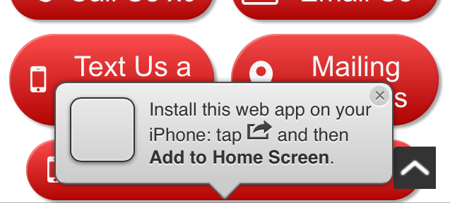
2. Obscuring the already limited viewport with an add to home screen plea
Maybe once in every 25,000 unique visitors you might encounter a user that:
- Doesn’t know they can bookmark your site by adding it to their home screen, allowing a slightly more app-like presentation when they launch it thusly;
- Cares about that even a little bit; and
- Visits your site enough to make this a positive.
The majority of visitors are probably just annoyed by that hovering link that scrolls with them and blocks a significant portion of the viewable area.
Bonus criminal points if you make it tricky to close! (Many do…)
Stop following me around, I got here from a search result
3. Interstitial Pages
C’mon folks, google even explicitly recommends you don’t do this… though admittedly I’ve written code that implemented this exact feature at my former employer so I’m guilty too.
Your native app is probably amazing and I’m sure your stats show that you’re getting more loyal customers through the app experience. But the casual visitor (likely a significant chunk of your traffic) is often unaware of your brand on this visit, and likely not interested (yet) in viewing, installing and navigating your app. Don’t disrupt their navigational flow to try the App Store promo far too early.
4. Full-Width Large Ads
If you place an ad in to your mobile web page that extends from each edge of the screen on both sides (or less than a fingertip’s width from the side) and is several hundred pixels tall, the chances are that your user will be scrolling your page and upon reaching the ad, may tap it without meaning to. If that then redirects them to an external page (or, shudder, the app store) you can at the very least expect an annoyed user and most likely, not see them again this visit as they decide not to bother going back to your page after that experience.
Leave room for scrolling to happen, and remember to bear in mind the behaviors present on a physical device when developing on a simulator or emulator.

Scroll past this priceline ad with an adult thumb and the rate drops to a dollar a day
5. “Full Website” Links
It’s 2015. Nobody wants a basic, feature-lacking version of your site just because they’re on a mobile device. Have you seen what the browsers on the latest smartphones are capable of lately?
Spend a little time and effort making your site look good and work well on at least the most popular smartphone browsers, and don’t penalize your users for choosing to visit you from their phone. They’ll thank you for it, and you’ll be rewarded ten-fold.

Can’t wait to see the features your blog offers that can’t be run on an iPhone 6 or a Galaxy S5…
This was cross-posted to my Medium account. You can view it on Medium if you prefer.
You can also follow me on Medium if you feel so inclined.